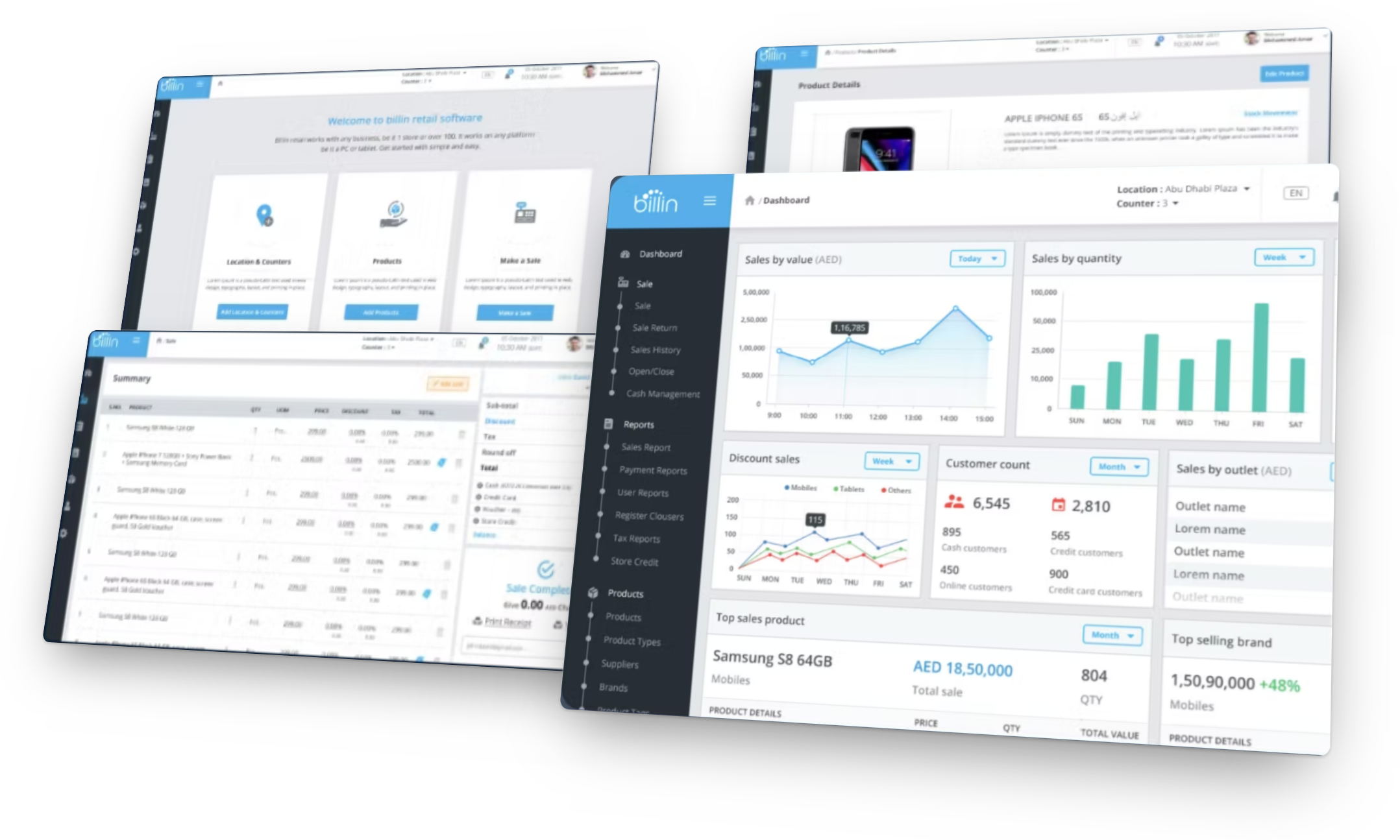
At a glance
Problem
VAT had just arrived in the UAE and Saudi Arabia. Axiom’s customers, small electronics retailers, needed a simple, affordable way to sell, track stock and stay compliant. Some had never used a point of sale; others wanted a better one.
My role
Senior UX Designer guiding a team of four designers. I led product discovery with Axiom’s stakeholders and focus groups, focused on sales, products, inventory, reports and onboarding, and worked with developers and QA through user acceptance testing.
Constraints
Requirement documents with deliberate gaps we had to fill, stakeholders based in Dubai, and a limited budget and timeline that forced us to focus on what mattered most to retailers and the business.
Approach
Discovery workshops with Axiom’s executives, walkthroughs with salespeople, and two user profiles. Workflows and wireframes before visual design, then A/B tests with focus groups. Seven months to the first release, then small releases shaped by feedback.
Outcome
Launched publicly in two phases, reaching around 1,500–2,000 users. After the free trial, 52% of retailers chose to pay and keep using Billin.
The biggest shift
Almost every number in a point of sale starts at the sales screen. We designed three sales flows, tested the two most different with retailers, and built on the one they found easiest.
Three decisions that mattered most
The decisions that shaped how retailers sell, start and trust the product. Each links to the full story.
A sales screen built for speed and accuracy
Errors at the till cost retailers money and reputation. We mapped the sale with salespeople, A/B-tested two layouts, and kept the open layout with clearer visual cues that most testers preferred.
How we did itOnboarding that shows instead of tells
A three-step welcome checklist and walkthroughs at launch. When heatmaps showed some new retailers leaving after a quick look, we added sample products and short video tutorials in their own language.
How we did itBuilt for how retailers in the region work
Arabic beside English, VAT receipts and tax reports, several stores and counters in one account, and split payments across cash, card, vouchers and store credit.
How we did itImpact
From pilot to public launch, with 52% of trial users choosing to pay.
“Kiran is a highly intelligent, innovative designer who can bring your ideas into designs. He was able to analyse our UX/UI needs immediately and offered creative insights that helped us better understand the task ahead of us in redesigning the user interface and enhancing the user experience of our site. I highly recommend him for his deep knowledge of user experience and his ability to distil issues and guide the non-expert to potential solutions.”
John Paul, PM at Axiom (BillinPOS)Rebuilding UPS’s mission-critical document imaging system
Read case studyThe opportunity
A large telecom retailer saw a way to support thousands of small retailers, and a new tax made the timing right.
Axiom is a major telecom retailer in the UAE and Saudi Arabia, with 120 branches and selling points and around 4,000 indirect sales channels, 2,000 of them directly managed. Around 80 delivery staff in vans serve thousands of small retailers across its regions. Axiom also offers after-sales care, credit lines, insurance, device refurbishment and more.
Axiom wants to be a one-stop shop for its customers. It saw a chance to offer them a point-of-sale product as software as a service that fits alongside its existing services. Three reasons made it a strategic move:
VAT was introduced for the first time in Saudi Arabia and the UAE, so businesses had to manage their finances more closely.
Products and services that work well together make the experience consistent, and customers who like one try others.
A point of sale is a base for new services over time, which sets the business up for long-term growth.
A mature space, a specific job
The checkout we all see, scan, pay, receipt, is only about a tenth of what a point of sale does. Many parts must work together for a sale to work. Systems split into traditional, hardware-heavy ones and web-based cloud ones, and many small and medium businesses choose cloud for its flexibility, access and lower upfront cost.
Billin was never meant to reinvent the point of sale. Its job was to solve specific problems for electronics retailers.
My role
Senior UX Designer, guiding a team of four from discovery to a two-phase launch.
I guided a team of four designers. My main focus was sales, product management, inventory management and reports, and I designed critical modules including sales, products, onboarding and B2B. As design lead, my work went beyond those features:
Product discovery
Ran discussions, observations and workshops with stakeholders and focus groups, and validated ideas through user research and benchmark reviews.
Execution and validation
Owned flows, wireframes and prototypes, logged and prioritised feedback from many sources, and ran A/B tests with power users.
Oversight and coordination
Worked with developers and QA on design specifications and guidelines so the build matched the design, and helped run user acceptance testing demos.
Research
Find the fit between the business, the product and the people using it, before designing anything.
The project started in Dubai, and a team of Axiom’s executive stakeholders travelled to our site to launch it. I worked closely with them to understand the product, the goals and how people would use it. The requirement documents had gaps on purpose, which pushed us to question our assumptions.
Learning the sale from salespeople
We started with the sales flow and worked backwards. Through conversations and walkthroughs I learned what a salesperson’s day looks like:
- their work environment and its challenges;
- how they avoid discrepancies, and what they do when things go wrong;
- the common actions in a sale, and how long a sale takes at peak hours;
- what they know about their customers;
- the tools they already use for accounts, products and customers, and how comfortable they are with technology.
Speed and accuracy make a sale feel effortless, for the cashier and for the customer waiting at the counter.
Reviewing other products
In lean design critiques we compared other products’ journeys, layouts, visual styles and information architecture. The differences raised questions we needed to answer to set a direction, including a modern, minimal style versus a “retro” style that puts every action up front, like a native app.
Who we designed for
Retailers of every size, from single stores to chains. We focused on two groups first, to build a solid base from zero to one.
Traditional retailers who want to modernise with a simple, friendly point of sale. They need help in their own language, care about cost and clear pricing, want to comply with local tax rules, and need Arabic for their staff.
- Easy transition
- Support
- Affordability
- Tax compliance
- Regional language
- Reliability
Owners switching to a better, more reliable system. They want quick support, many payment methods, easy control of stock, orders and sales, and a product made for electronics stores, not a generic one.
- Multiple stores
- Payment options
- Inventory control
- Tailored features
- Tax compliance
- Support
High-level profiles, simplified for this page.
How we solved it
Four decisions I led hands-on, ordered by impact on retailers’ daily work. Each shows the evidence, what we did and the result.
01 · A sales screen built for speed and accuracy
Cashiers, store owners and sales associates use the sales screen all day, and many numbers in the product come from it.
The problem
The sales screen is the source of truth during a sale: prices, discounts and promotions must be right, in real time. Customers never touch the system, yet they feel every error and delay, and those cost the business money and reputation.
What I did
- Mapped the full sale with salespeople: find or scan a product, change price or discount, add a customer, take payment in several ways, and print or email the receipt.
- Designed three sales flows, each with its own journey and look, and tested the two most different with focus groups from both user groups.
- Asked testers to search products, build a sale, review payment, add or find a customer and pay with different methods, with open questions about what they preferred. Stakeholders reviewed InVision prototypes too.
The trade-off
I started out sure the modern, minimal approach was right. Exploring several flows for sales, payment and receipts took real time and effort, but it showed what users actually preferred and could do, not what I assumed.
Result: most responses favoured Option A, for its open layout and clear visual cues, and it gave a positive task completion rate. Testing also brought feature requests that we added in later releases: a layout for tablets, quick access to frequent products, recent sales history in a few steps, and saving a sale to pick up later.
02 · Onboarding that shows instead of tells
If retailers can’t see how the product works, they stop using it or move to a competitor.
The problem
With products, inventory and sales in place, leaving new users to find their own way was a real risk. I set three goals: guide people to the moment they see the value, cut the steps to get started, and ease worries with clear help.
What I did
- Researched onboarding patterns in other products, and chose with stakeholders and focus groups the ones we could build and test quickly within our technical and time limits.
- Designed a three-step welcome checklist (locations and counters, products, first sale) and interactive walkthroughs that introduce each part of a feature.
- After launch, used heatmaps and task timing (signing up, adding locations and items, making the first sale) to see where people struggled.
- Heatmaps showed some users leaving after a brief look, mostly the “late to the party” group, who told us they felt underwhelmed and unsure how it all worked. So we added sample products already loaded and short video tutorials in their own language.
The trade-off
There were many onboarding ideas. We stayed with the ones we could build and test fast, and let real usage tell us what to add next.
Result: most new users explored the whole product on their own. After the sample products and tutorials, feedback was positive: retailers found onboarding quicker and easier to follow.
03 · Built for how retailers in the region work
Both user groups asked for things a generic point of sale didn’t offer: their language, local tax rules and support for how their stores run.
The problem
Retailers needed Arabic for their staff, compliance with the new tax rules, several stores and counters, and many ways to take payment. These needs came straight from our two user profiles.
What we built
- Product names in a second language (Arabic) beside English, and a language switch in the header.
- VAT receipts straight from the sale, and tax reports in the menu.
- A location and counter switch, so one account runs several stores.
- Split payments across cash, card, vouchers and store credit.
The trade-off
We designed for two specific groups first, not every retailer, while keeping the product easy for a broad audience.
“Switching to the new POS resolved the pain points we faced with our previous system, notably the lack of regional customer and language support.”
Retailer using Billin, survey04 · Validated in flows and wireframes before visual design
Sales, products and inventory were complex. We got their steps and structure right first.
The problem
Sales, products and inventory each had many steps and branches. We needed to confirm the right steps and journey for each task with stakeholders.
What I did
- Mapped workflows for the most complex tasks, which let us validate steps with stakeholders on the spot, even before wireframes.
- Used wireframes to set the information hierarchy and priorities for sales, product and inventory.
- Iterated several versions with stakeholders and focus-group feedback.
Why it mattered
We could test and change the structure quickly, across several versions, before any visual design.
Beyond these four
Billin covered much more: dashboards, sales history and reports, the product catalogue and variants, purchase orders and receiving stock, stock transfers, commissions and offers. We spent seven months designing and iterating before the first release, then shipped features and improvements in small steps based on feedback.
Impact
From pilot to public launch, with 52% of trial users choosing to pay.
What retailers said
“BillinPOS facilitated our digital transformation seamlessly, without disrupting our established business style. It operates with simplicity and enhances both product vigilance and customer engagement.”
Retailer using Billin, survey“Switching to the new POS resolved the pain points we faced with our previous system, notably the lack of regional customer and language support. Testing it as a sideline, we found it aligns perfectly with our expectations, and we are eager to continue its use.”
Retailer using Billin, survey“Billin POS has significantly reduced the time spent reconciling stock discrepancies in our stores, allowing us to focus more on customer engagement.”
Retailer using Billin, survey“The new POS is user-friendly, affordable, and frictionless. It has helped us maintain an organized store, with control over sales, purchases, and cash management.”
Retailer using Billin, during a demoWhat people said
Feedback from the client and the programme team.
“Kiran is a highly intelligent, innovative designer who can bring your ideas into designs. He was able to analyse our UX/UI needs immediately and offered creative insights that helped us better understand the task ahead of us in redesigning the user interface and enhancing the user experience of our site. I highly recommend him for his deep knowledge of user experience and his ability to distil issues and guide the non-expert to potential solutions.”
John PaulPM at Axiom (BillinPOS)“Your ability to identify problems enables us to solve them quickly and timely. This kind of thinking puts us ahead of the game!”
In-house Program ManagerWhat I learned
Context beats assumptions, and decisions need a home.
One size doesn’t fit all
At first the project didn’t seem challenging: the space felt mature. The stakeholder workshops showed I had ignored the users’ context and demographics. Every product has its own users, constraints and expectations.
What I’d do differently: streamline research and documentation
Requirement documents captured what we built, not the designer’s reasoning, which later left us unsure about some past decisions. Next time I’d streamline research from the start and keep one design journal and tracker at feature or screen level, so “why did we do this?” always has an answer.
Focus is a choice
Budget and time made us focus on what mattered most to retailers and the business. Competitors offered more, but Billin did the job it was made for.